How the Weekly Ranking Works
One vote per prompt, a fresh count every Monday, and a simple tie-break. Everything about how prompts reach the top three, in plain words.
Paste raw CSV data and get a publication-ready SVG chart with sensible scales, direct labels and a title that states the finding.
Turn this data into one clear chart, as a standalone SVG.

What I want to show: [THE QUESTION OR THE POINT, e.g. "signups jumped after the launch"]
Where it will be used: [e.g. slide, blog post, report]

```csv
[PASTE YOUR CSV]
```

Requirements:
- Choose the chart type that fits the data and say why in one sentence.
- The title states the finding, not the topic. For example "Signups tripled after the March launch", not "Signups by month".
- Label values directly on the chart where possible instead of using a legend.
- Start bar charts at zero. Use at most two colours: one neutral, one to highlight what matters.
- Output a single `<svg>` with a viewBox, using only basic shapes and text, so that it scales and can be edited later.
- Below the chart, tell me one thing in the data that I should double check before publishing.
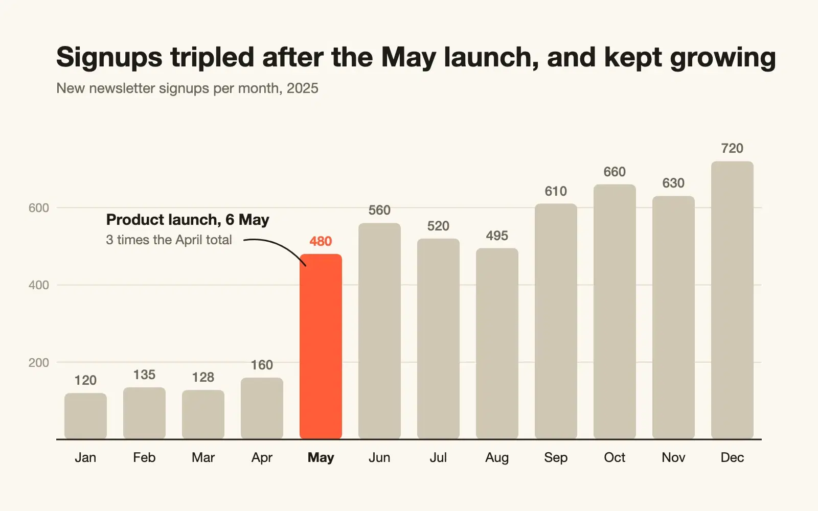
A bar chart fits best, because these are twelve separate monthly totals. The launch month is highlighted and labelled directly, every other bar stays neutral, and the title states the finding.
NoteThis is an example. Results change between runs and model versions. Prompt Podium is a fan project and is not affiliated with Anthropic.
When you have a small table and need one clear chart for a slide, a report or a blog post. It works well up to a few hundred rows. For larger files, summarise the data first or paste a sample and describe the rest.
Check a few numbers on the chart against your CSV, especially totals and anything that was sorted. The title states a finding, so make sure the data supports it: "tripled" should mean three times. The "one thing to double check" line at the end is worth reading. It often catches a missing month or an outlier that would be embarrassing after publishing.
Use the copy button above. The full text is included, nothing is cut off.
Everything highlighted in yellow is a placeholder. Swap it for your own topic, audience or data.
If the result helped, press the heart. Votes decide which prompts make the weekly top 10.
1. Correctness Revenue is counted more than once. JOIN orderitems produces one row per item, so SUM(o.total) adds the same order total once for every item in it. An order with three items is tripled. "Today" is the server's...
Get a slow SQL query checked for wrong results first and speed second, with a rewrite, the exact indexes to add and a way to verify the gain.
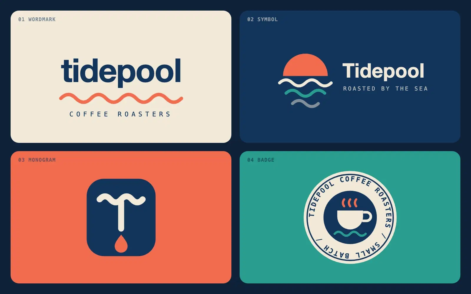
Describe a brand in a sentence and get four distinct logo directions as clean SVG code you can open in a browser or drop into Figma.
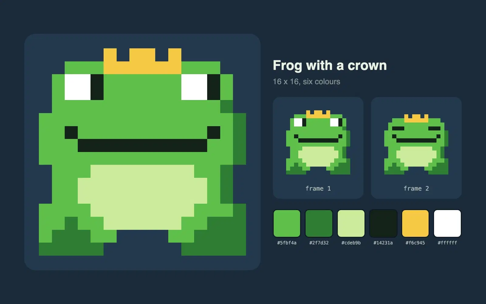
Describe a character and get a 16 by 16 pixel sprite as crisp SVG, with a limited palette and a second frame for a simple idle animation.
One vote per prompt, a fresh count every Monday, and a simple tie-break. Everything about how prompts reach the top three, in plain words.
Wrapping parts of your prompt in simple tags is one of the easiest ways to get more reliable answers from Claude. A practical guide with examples.