Seven prompt mistakes that quietly ruin your results
None of these cause an error message. They just make every answer a little worse. Here is how to spot each one and what to write instead.
Describe a character and get a 16 by 16 pixel sprite as crisp SVG, with a small palette and a second frame for an idle animation.
Draw me a pixel art character as SVG.

Character: [DESCRIBE IT, e.g. "a cheerful frog wearing a tiny crown"]
Style: [e.g. 8-bit console, cosy farming game, dark dungeon crawler]

How to build it:
- A 16 by 16 grid. Every pixel is one `<rect>` of width 1 and height 1, inside an `<svg>` with viewBox 0 0 16 16 and shape-rendering set to crispEdges.
- Six colours at most. List the palette with hex codes.
- The silhouette has to read. I should recognise it as a solid black shape.
- One pixel of darker outline on the lower right, as if the light comes from the upper left.
- Then a second frame for a two frame idle animation. Change as few pixels as you can, and tell me which ones.
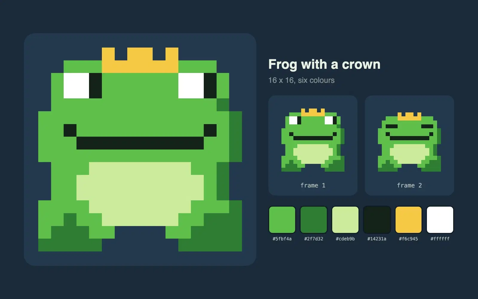
A frog with a crown, drawn on a 16 by 16 grid with a six colour palette. In the second frame the eyes close and the body drops by one pixel, which is enough to make the sprite feel alive when the two frames alternate.
NoteThis is an example. Results change between runs and model versions. Claude Prompts is a fan project and is not affiliated with Anthropic.
Placeholder sprites for a game jam, avatars for a side project, icons with a retro feel, or just for fun. The grid is tiny on purpose. At 16 by 16 you're forced into a readable silhouette, which is the hard part of pixel art anyway.
Describe one clear feature: "a frog with a crown", "a robot with one big eye". Give a character three accessories and at this size it turns into noise. A style reference, like 8-bit console or cosy farming game, steers the palette. If you want more detail, change the grid to 24 by 24 or 32 by 32 and raise the colour limit to eight.
Don't judge the sprite zoomed in. Shrink it to 32 pixels wide, and if you can't tell what it is, ask for a simpler silhouette. When you scale it up, keep the crispEdges setting and use image-rendering: pixelated in your CSS, or the browser will blur the pixels.
Use the copy button above. The full text is included, nothing is cut off.
Everything highlighted in yellow is a placeholder. Swap it for your own topic, audience or data.
If the result helped, press the heart. Votes decide which prompts make the weekly top 10.
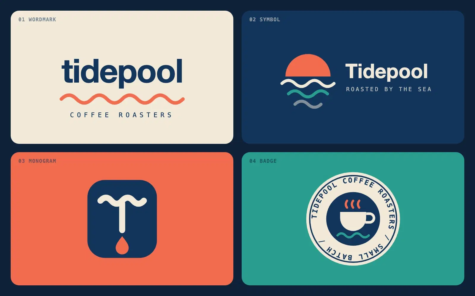
Describe a brand in one sentence and get four different logo directions as clean SVG you can open in a browser or drop into Figma.
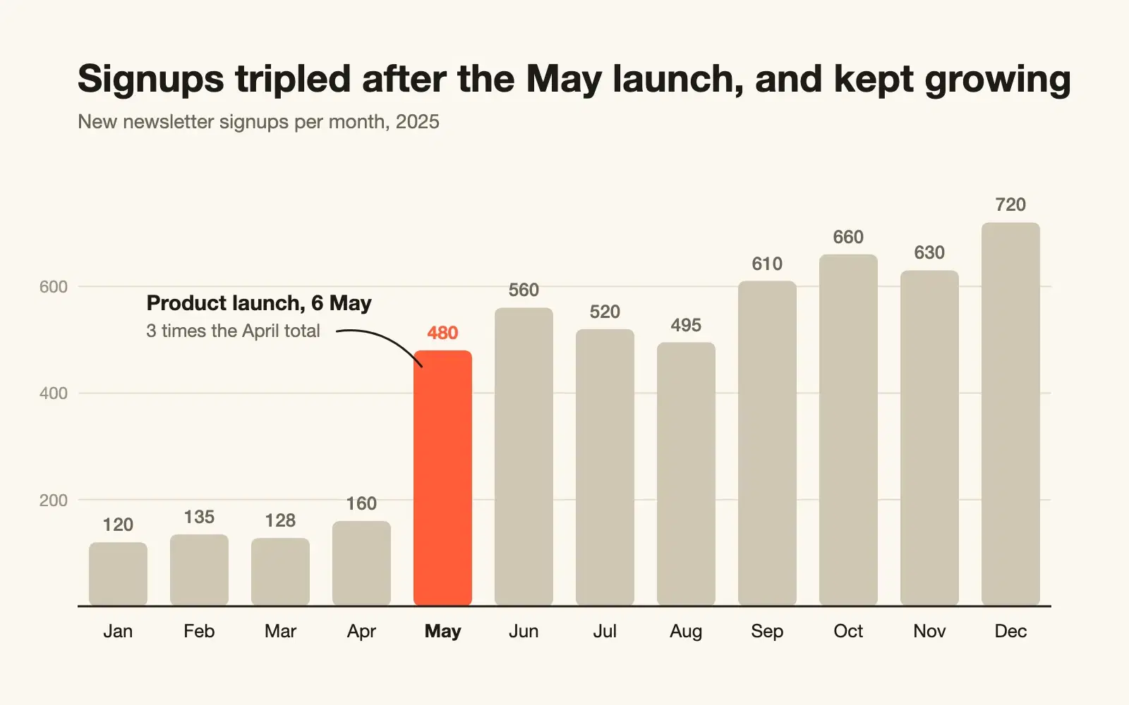
Paste raw CSV and get a clean SVG chart with sensible scales, labels on the data, and a title that says what the chart shows.
None of these cause an error message. They just make every answer a little worse. Here is how to spot each one and what to write instead.
Most disappointing answers come from prompts that are missing one of five parts. Here is what each part does, with a before and after you can copy.