How the weekly ranking works
One vote per prompt, a fresh count every Monday, and a simple tie-break. Everything about how prompts reach the top three, in plain words.
A complete, responsive hero section in a single HTML file. No frameworks, no images, ready to paste into a site or build on.
Build me a landing page hero section as one self-contained HTML file.

Product: [NAME AND ONE SENTENCE ABOUT IT]
Who it's for: [AUDIENCE]
Main action: [e.g. join the waitlist]
Mood: [e.g. friendly and bright, calm and premium, bold and loud]

What I need:
- A single HTML file with the CSS in a `<style>` tag. No frameworks, no external fonts, no image files.
- If there's an illustration, build it from CSS or inline SVG.
- Responsive from 360 pixels wide up to large desktops, using modern CSS (grid, clamp, custom properties).
- It should have a small navigation bar, a headline, one supporting sentence, a primary button, a line of social proof, and one visual that makes the product concrete.
- Accessible: real heading levels, visible focus states, and text contrast of at least 4.5 to 1.
- Write real copy for the product. No lorem ipsum.

After the code, give me three other headlines I could test.
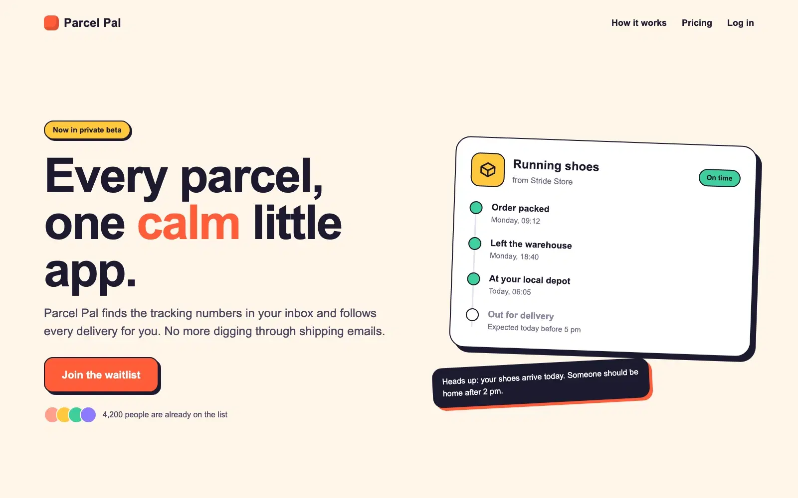
A complete hero for Parcel Pal, an app that tracks every delivery in one place. The file is 140 lines, has no dependencies, and the parcel card on the right is drawn entirely with CSS and inline SVG.
NoteThis is an example. Results change between runs and model versions. Claude Prompts is a fan project and is not affiliated with Anthropic.
A working starting point in a few minutes. A waitlist page for an idea you want to test, a hero to show a client before any design work starts, or a clean base to paste into your own site. It's one file with no build step, so it opens in any browser.
The mood line drives the colours and the type. Try the same product with "calm and premium" and then with "bold and loud" and you'll have two directions to compare in no time. Use your real main action, because "Join the waitlist" and "Book a demo" lead to different layouts and different supporting copy. A dark version, or the next section down the page, is one follow-up message away.
Replace the social proof line with a true number, or take it out. Check the page at phone width yourself, because responsive CSS that looks right in the code can still wrap badly with your real headline. And run the final colours through a contrast checker.
Use the copy button above. The full text is included, nothing is cut off.
Everything highlighted in yellow is a placeholder. Swap it for your own topic, audience or data.
If the result helped, press the heart. Votes decide which prompts make the weekly top 10.
Five second test. A new visitor would think this is "some kind of AI dashboard for teams". You sell automatic invoice reminders for freelancers, and nothing above the fold says invoice, freelancer or paid. The five biggest...
A blunt review of your landing page copy: what confuses visitors, which claims need proof, and three new hero sections to test.
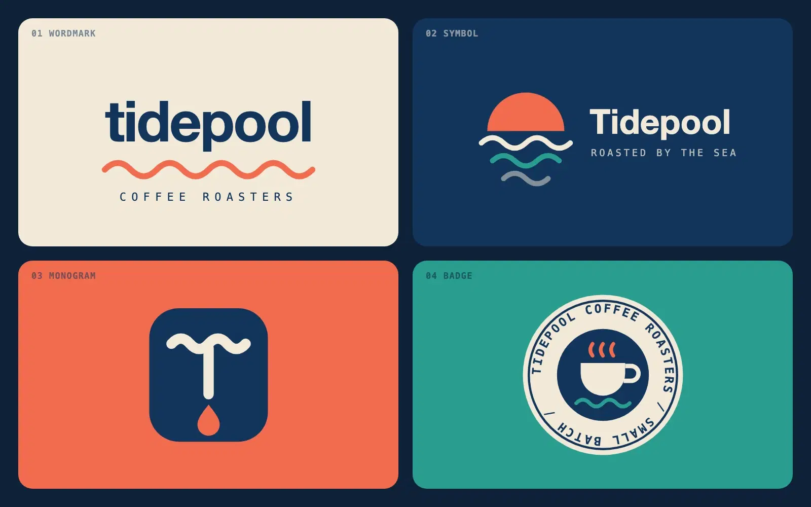
Describe a brand in one sentence and get four different logo directions as clean SVG you can open in a browser or drop into Figma.
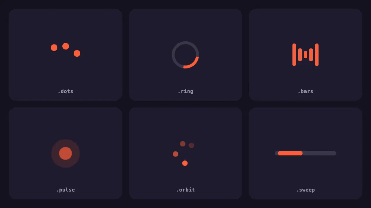
Six lightweight loading indicators in pure CSS. Each has a reduced motion fallback, and one variable changes the colour of all of them.
One vote per prompt, a fresh count every Monday, and a simple tie-break. Everything about how prompts reach the top three, in plain words.
Wrapping parts of your prompt in simple tags is one of the easiest ways to get more reliable answers from Claude. A practical guide with examples.