Seven prompt mistakes that quietly ruin your results
None of these cause an error message. They just make every answer a little worse. Here is how to spot each one and what to write instead.
Name the actions in your app and get a matching set of line icons as SVG, all on the same grid with the same stroke, so they look like they belong together.
Design me a set of icons for these actions, all in one consistent style.

Actions: [LIST THEM, e.g. home, search, settings, calendar, chat, notifications, upload, download, edit, delete, user, help]
Style: [e.g. simple line icons, rounded corners, friendly]
Where they'll be used: [e.g. a mobile app toolbar, a web dashboard sidebar]

Rules for consistency:
- Every icon lives on a 24 by 24 grid with 2 pixels of padding, so the drawing sits in the middle 20 by 20.
- Same stroke width for all of them (2 pixels), round caps and round joins, no fills unless an icon can't be read without one.
- Similar visual weight. A "settings" cog and a "home" house should feel equally heavy.
- Each icon is its own `<svg>` with `viewBox="0 0 24 24"`, `fill="none"`, `stroke="currentColor"`, so I can colour them with CSS.

Give me all the SVGs, then one HTML snippet that shows them in a row so I can check they match.
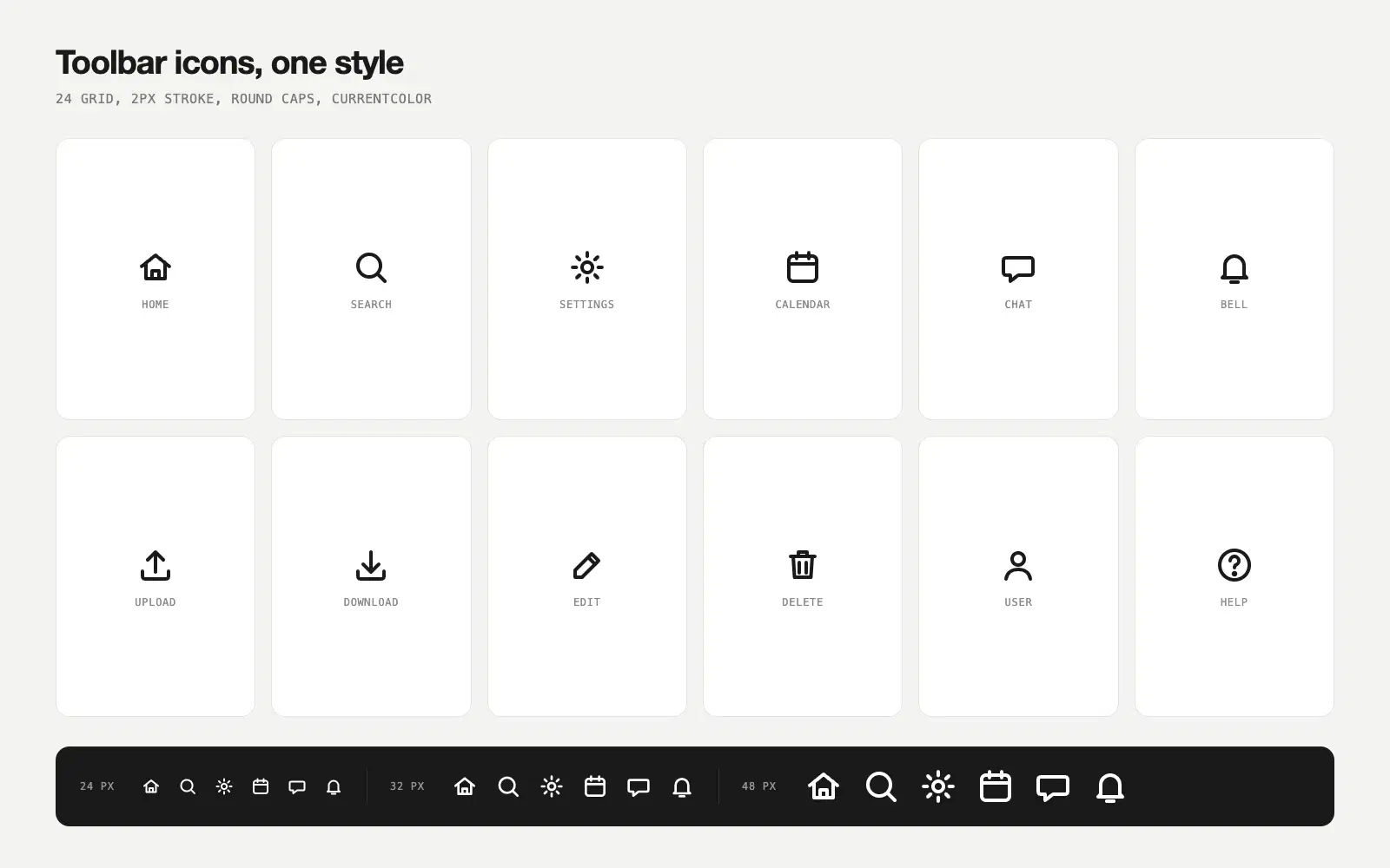
Twelve icons on one 24 by 24 grid, all at a 2 pixel stroke with round caps. They take their colour from currentColor, so a single CSS rule recolours the whole set. The preview shows them side by side at 24, 32 and 48 pixels so you can check the weights match at each size.
NoteThis is an example. Results change between runs and model versions. Claude Prompts is a fan project and is not affiliated with Anthropic.
Icons drawn separately drift: one gets a heavier stroke, another sits lower on the grid, and the toolbar looks slightly off without anyone knowing why. Asking for the whole set in one go, with the grid and stroke spelled out, is how you get icons that look like a family.
The stroke width and corner style set the personality. 1.5 pixels with round caps reads light and friendly, 2 pixels with square caps reads technical. Change those two numbers in the prompt and you get a different set. If you already use an icon library and only need a few icons it doesn't have, paste one of its SVGs as a reference and add "match this exactly".
Look at the row at 24 pixels, which is the size they'll actually be used at. If two icons blur together or one looks bolder than the rest, ask for those specific ones again. And test the "delete" and "edit" icons with users if you can, because those two carry the most meaning and the most risk.
Use the copy button above. The full text is included, nothing is cut off.
Everything highlighted in yellow is a placeholder. Swap it for your own topic, audience or data.
If the result helped, press the heart. Votes decide which prompts make the weekly top 10.
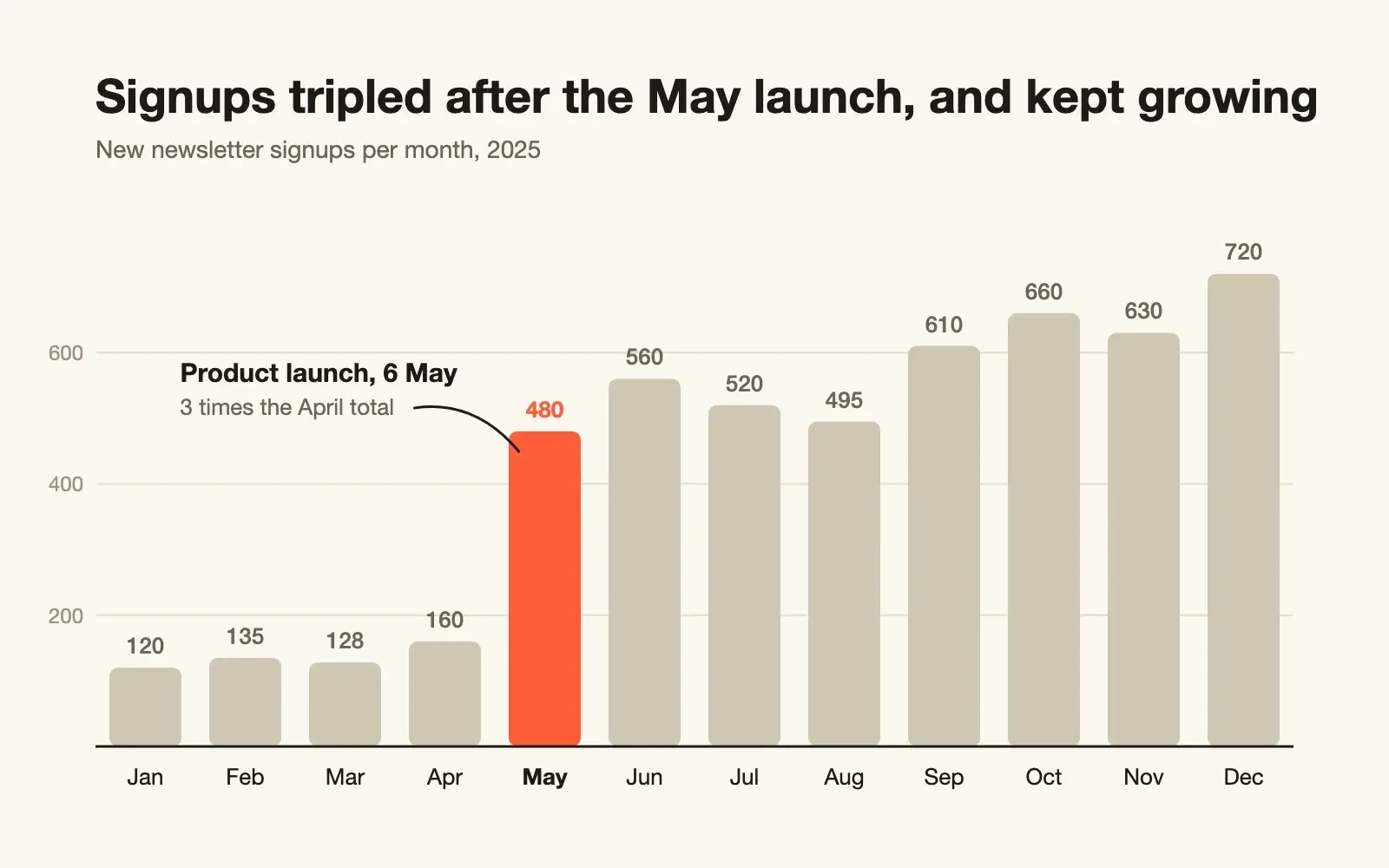
Paste raw CSV and get a clean SVG chart with sensible scales, labels on the data, and a title that says what the chart shows.
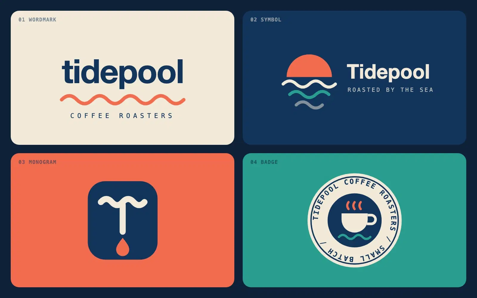
Describe a brand in one sentence and get four different logo directions as clean SVG you can open in a browser or drop into Figma.
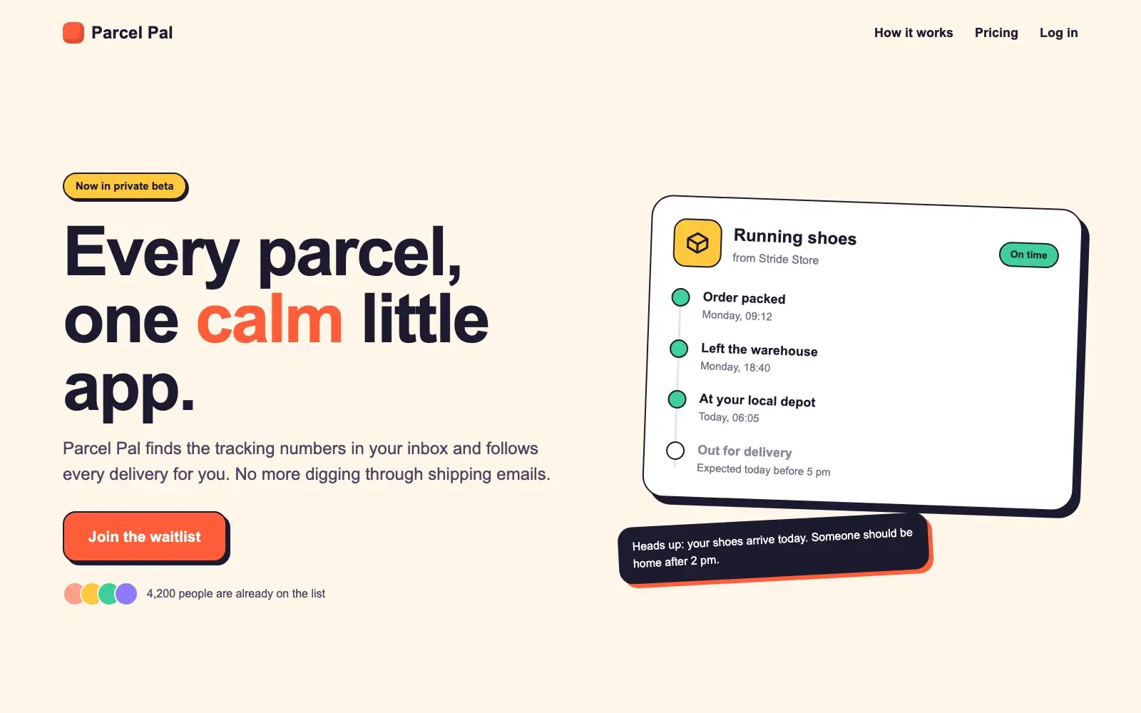
A complete, responsive hero section in a single HTML file. No frameworks, no images, ready to paste into a site or build on.
None of these cause an error message. They just make every answer a little worse. Here is how to spot each one and what to write instead.
Most disappointing answers come from prompts that are missing one of five parts. Here is what each part does, with a before and after you can copy.