How to use XML tags in Claude prompts
Wrapping parts of your prompt in simple tags is one of the easiest ways to get more reliable answers from Claude. A practical guide with examples.
Describe the layout of a page and get a loading skeleton in CSS where every grey block is the exact size of the content it stands for, with a shimmer, a reduced motion fallback and a demo that fades the real content in without anything jumping.
Build a skeleton loading screen for this page, as one HTML file I can open and watch.

The page layout: [DESCRIBE IT, e.g. a top bar with an avatar, a name and a subtitle; a wide hero image with a title and two lines; three cards in a row, each with an image, a title and two lines. Or paste the HTML of the real page]
What loads first, if anything: [e.g. the top bar is already there, the rest comes from one API call]
Brand colour: [HEX or "your call"]

Rules:
- Every placeholder has the same width, height, radius and position as the content it stands for. When the content arrives, nothing moves and nothing resizes. Reuse the page's own CSS classes for the layout; only the inside of each block changes.
- A slow shimmer across the placeholders. Under prefers-reduced-motion, a gentle opacity pulse instead, or nothing.
- Placeholders are aria-hidden and the container has aria-busy while loading, so a screen reader doesn't read out a page of empty boxes.
- The demo shows the skeleton for about three seconds, then fades the real content in block by block in reading order. Include a replay button.
- One CSS variable for the placeholder colour, one for the shimmer colour, and one for the fade duration.

Keep the skeleton CSS in its own section at the top of the file, so I can lift it into the real project.
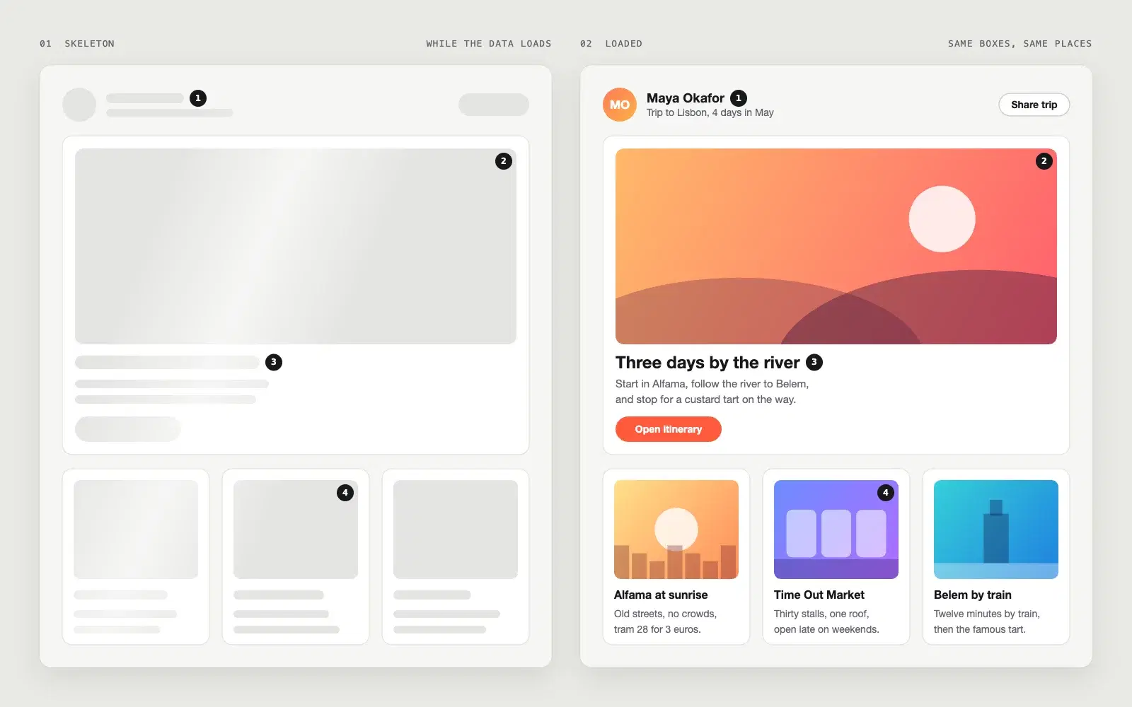
Two views of the same page. The demo shows a profile style layout (top bar, hero, three cards) as grey placeholders with a shimmer, then fills each block in reading order with nothing shifting, and has a replay button, three CSS variables and a reduced motion fallback. The sheet puts the skeleton and the loaded page side by side so the matching sizes are plain to see.
NoteThis is an example. Results change between runs and model versions. Claude Prompts is a fan project and is not affiliated with Anthropic.
A skeleton that is roughly the shape of the page is worse than a spinner, because when the content lands everything jumps and the reader loses their place. The first rule in the prompt is that every placeholder is the exact size of what replaces it, and the easiest way to get that is to reuse the page's own layout classes, which is why the prompt asks for the real HTML if you have it.
Play it once looking at the whole page, then once looking at a single card. On the second viewing you should see the text appear inside the block without the block changing. If something shifts, the placeholder wasn't the right size, and the fix is in the skeleton CSS, not in the animation.
If the top bar renders before the data call, say so. A skeleton over content the user could already see is a step backwards. The prompt asks what loads first for exactly this reason, and it's worth answering precisely.
Use the copy button above. The full text is included, nothing is cut off.
Everything highlighted in yellow is a placeholder. Swap it for your own topic, audience or data.
If the result helped, press the heart. Votes decide which prompts make the weekly top 10.
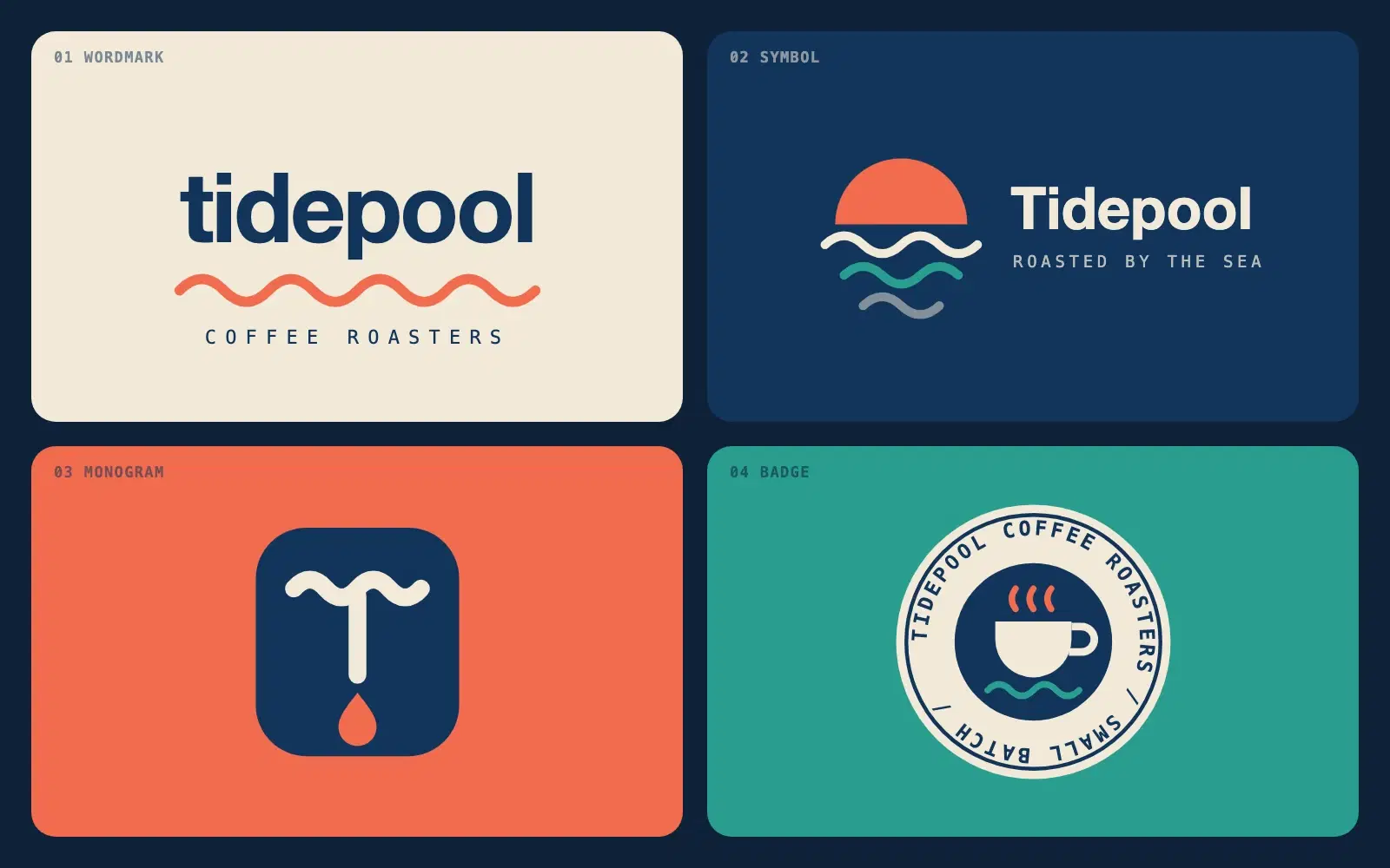
Describe a brand in one sentence and get four different logo directions as clean SVG you can open in a browser or drop into Figma.

A complete, responsive hero section in a single HTML file. No frameworks, no images, ready to paste into a site or build on.
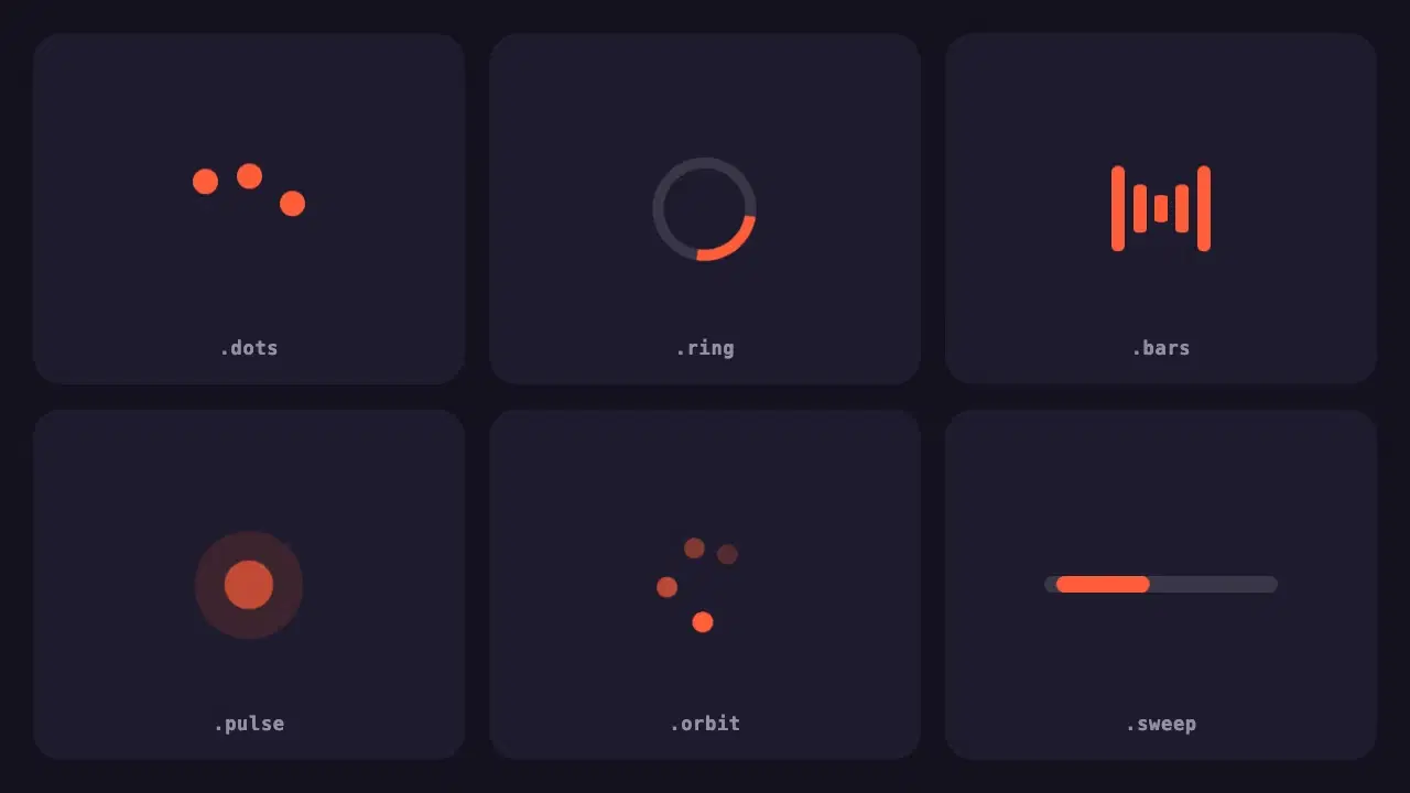
Six lightweight loading indicators in pure CSS. Each has a reduced motion fallback, and one variable changes the colour of all of them.
Wrapping parts of your prompt in simple tags is one of the easiest ways to get more reliable answers from Claude. A practical guide with examples.
None of these cause an error message. They just make every answer a little worse. Here is how to spot each one and what to write instead.