The anatomy of a Claude prompt that works the first time
Most disappointing answers come from prompts that are missing one of five parts. Here is what each part does, with a before and after you can copy.
Tell Claude about your site and its tone and get a 404 page as one HTML file that says what happened in plain words, guesses where the visitor wanted to go, and offers a search box and the main sections, with the copy written to match the brand.
Build a 404 page for my site as one HTML file, no frameworks.

Site: [NAME AND WHAT IT IS, e.g. Fern, a plant care app]
Tone: [e.g. playful and warm, calm and minimal, technical]
Main sections to link: [e.g. Home, Pricing, Help, Blog]
Brand colour and font if any: [HEX, FONT, or "your call"]
Common broken links, if I know them: [e.g. /pricing-old now lives at /pricing]
Is there a search? [yes, at /search?q=, or no]

The page should:
- Say in one plain sentence that there's nothing at this address, and show the path that failed (fill it in from window.location.pathname).
- Guess where the visitor wanted to go when it can: a short list of old paths mapped to new ones lives at the top of the script, and if the current path matches one, the page shows "you probably want [link]" above everything else.
- Offer a search field (if there's search) and the main sections as links. No sitemap dump.
- Match the tone. A playful brand can have an illustration made of CSS shapes and a joke in the headline, a minimal one gets a quiet headline and more space, a technical one gets monospace and a "report a broken link" button that opens an email with the path pre-filled.
- Return the real 404 status: add a comment at the top explaining how to serve this file with a 404 code on [Netlify, Vercel, nginx, or my setup].
- Work on a phone, with the headline readable without scrolling.

No "oops", no "looks like you're lost", no stock astronaut.
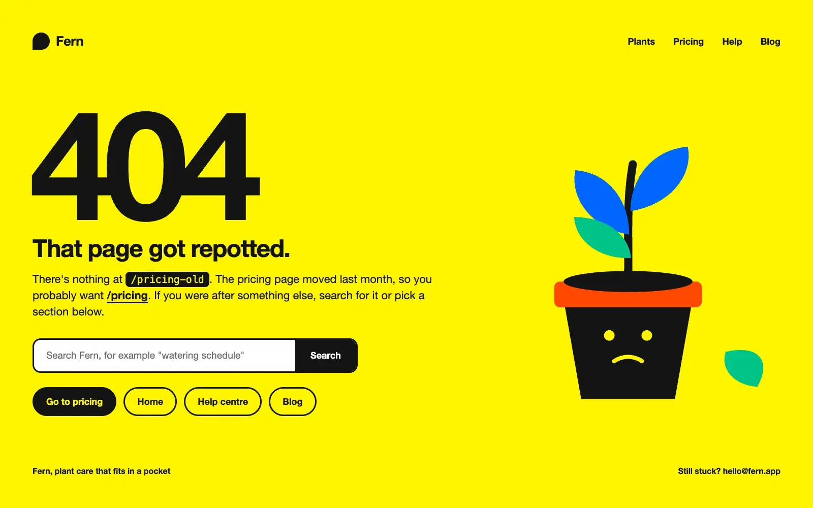
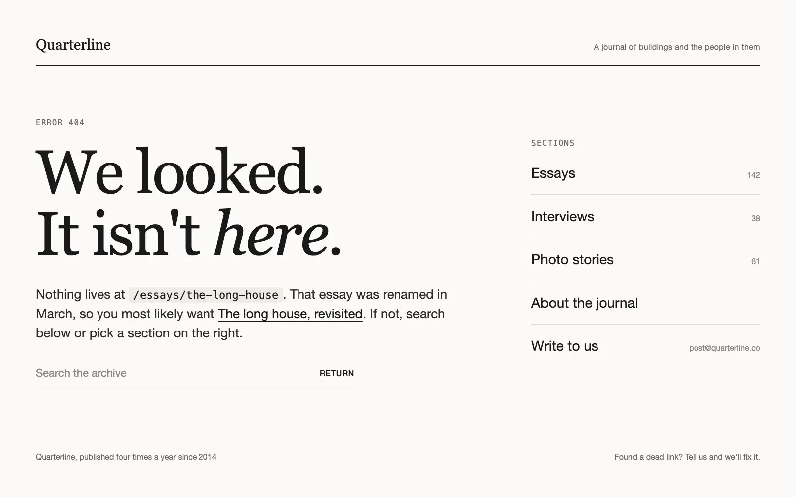
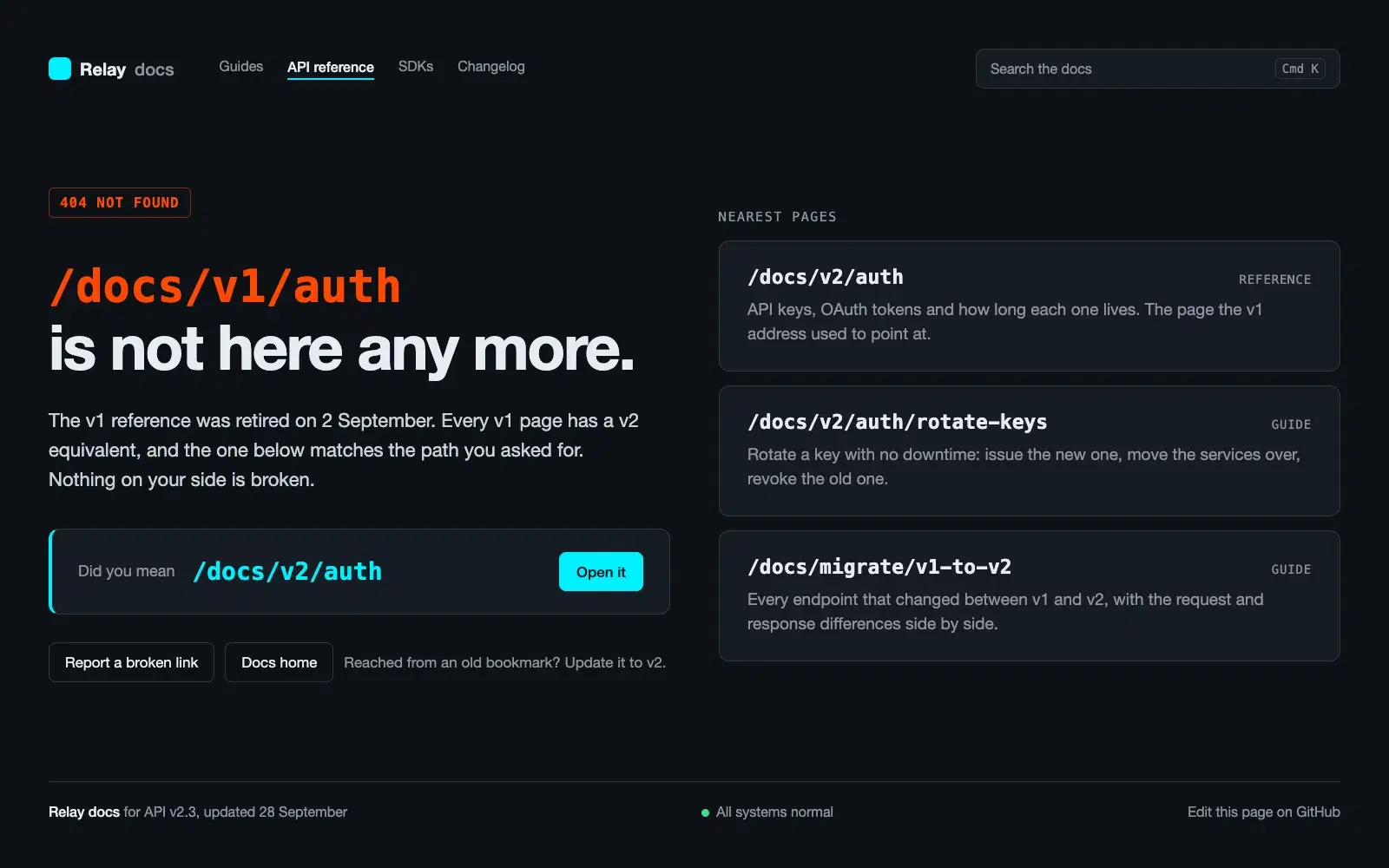
Three runs of the same prompt with a different tone line: a bright page for a plant app with a shape illustration and a redirect hint, a quiet off-white page for a journal with the renamed essay linked, and a dark docs page that lists the nearest pages. Each one shows the failed path, offers search and the main sections, and starts with a comment on how to serve it with a real 404 status.
NoteThis is an example. Results change between runs and model versions. Claude Prompts is a fan project and is not affiliated with Anthropic.
A 404 page is the one page every site has that nobody designs, so most of them say "oops" and stop there. The visitor arrived with an intent, and a useful page tells them three things: the address doesn't exist, where they probably meant to go, and how to get there. The prompt bans the stock phrases because they're the sign that nobody thought about any of that.
Most 404s on a real site come from a handful of old addresses: a renamed page, a moved blog post, a campaign link with a typo. The page keeps a short map of those at the top of its script and shows the right link when it recognises the path. Look at your analytics or server logs for the top broken addresses before you run the prompt and paste them in. Five lines there will catch most of your lost visitors.
The three previews are the same prompt with a different tone line. The structure (sentence, failed path, guess, search, sections) stays the same; what changes is the headline, the amount of space and whether there's an illustration. Pick the one closest to your brand and describe it in the tone field, rather than asking for "something nice".
A pretty page that returns 200 teaches search engines that the broken address is a valid page. The comment at the top of the file shows how to attach it to a real 404 status on your host. Don't skip that step; it's the difference between a 404 page and a page that says 404.
Use the copy button above. The full text is included, nothing is cut off.
Everything highlighted in yellow is a placeholder. Swap it for your own topic, audience or data.
If the result helped, press the heart. Votes decide which prompts make the weekly top 10.
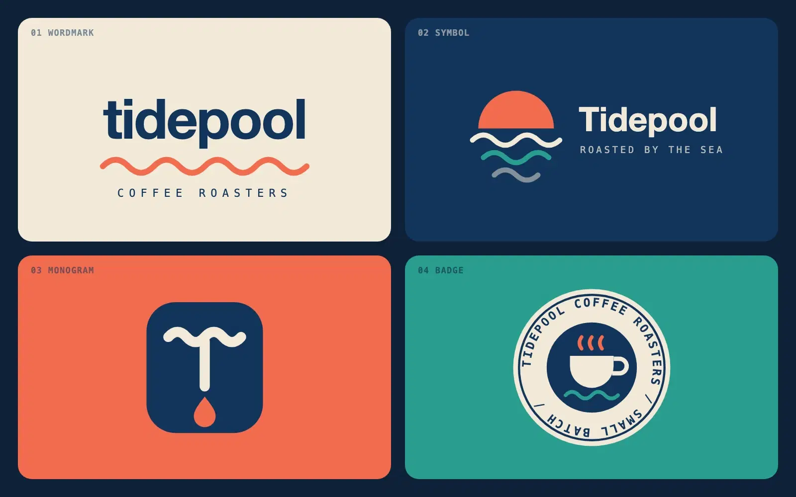
Describe a brand in one sentence and get four different logo directions as clean SVG you can open in a browser or drop into Figma.
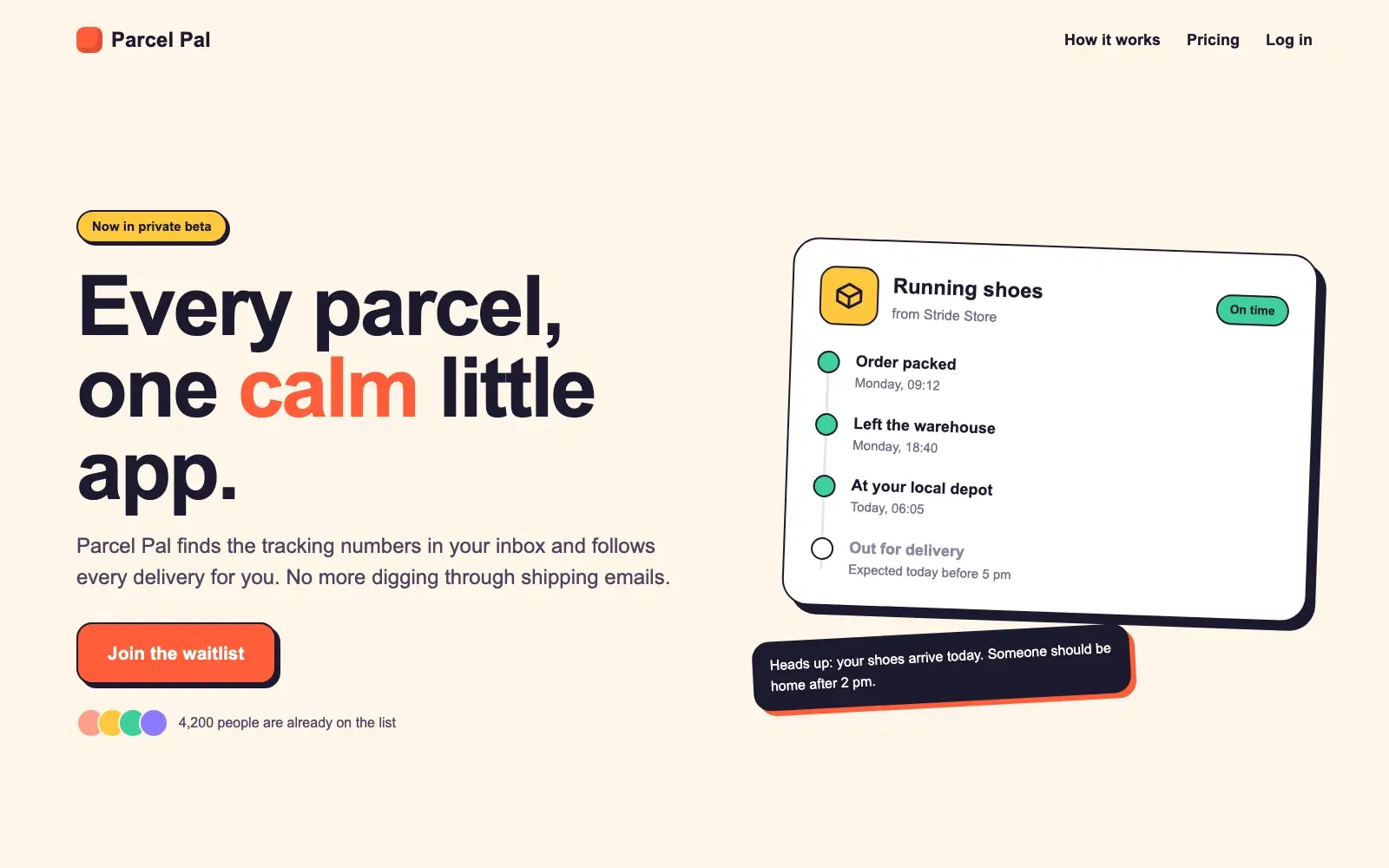
A complete, responsive hero section in a single HTML file. No frameworks, no images, ready to paste into a site or build on.
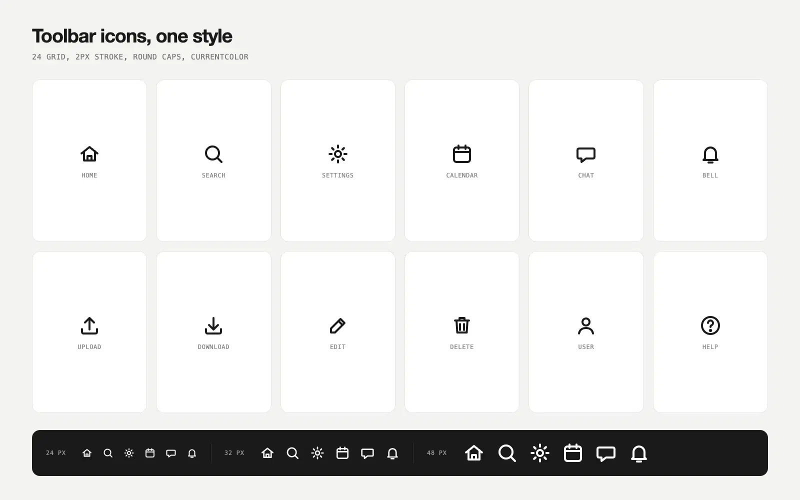
Name the actions in your app and get a matching set of line icons as SVG, all on the same grid with the same stroke, so they look like they belong together.
Most disappointing answers come from prompts that are missing one of five parts. Here is what each part does, with a before and after you can copy.
One vote per prompt, a fresh count every Monday, and a simple tie-break. Everything about how prompts reach the top three, in plain words.